Overview and The Motive
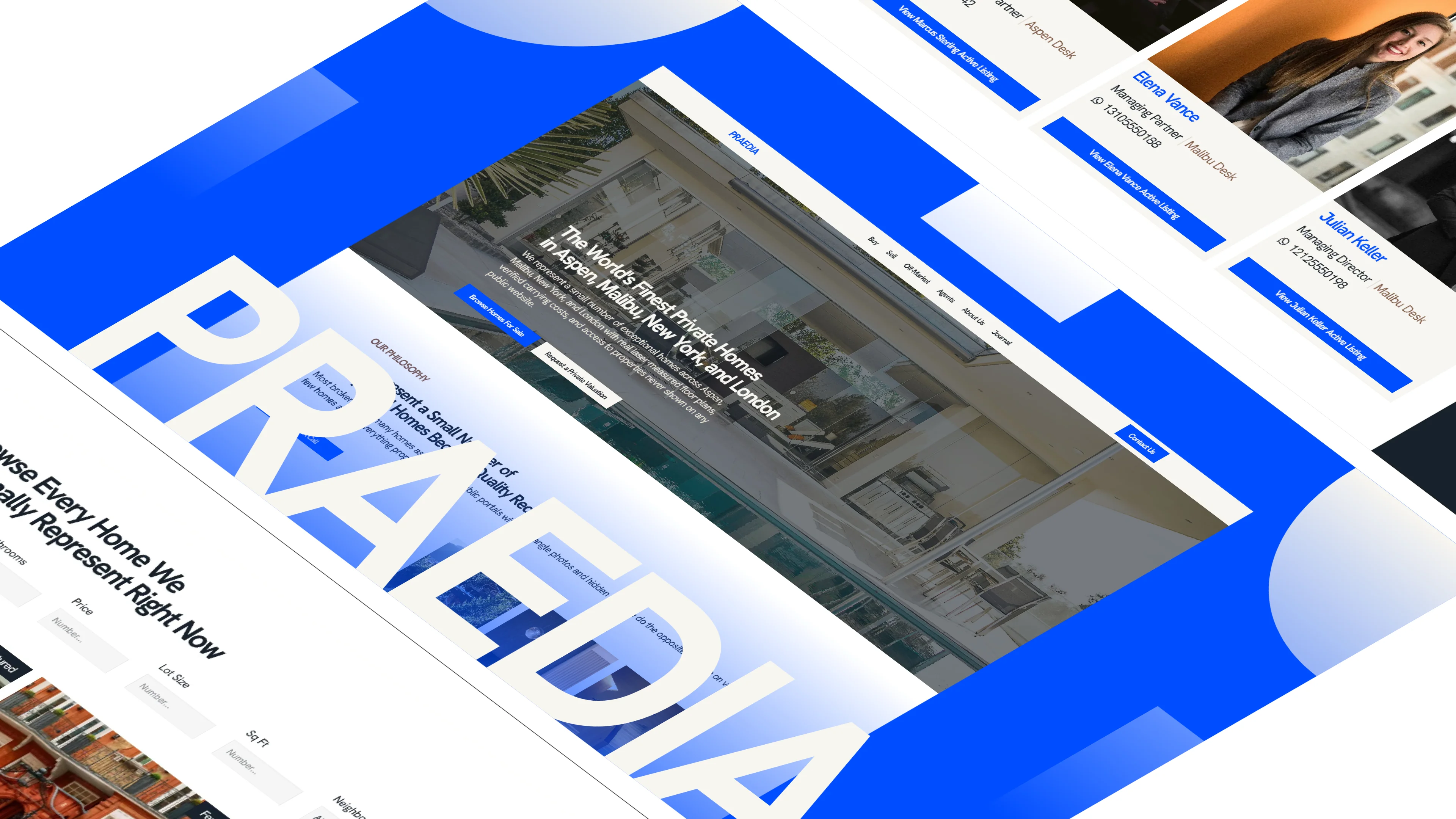
Version 2 began in the middle of October 2026 right after I completed the Praedia project. My original plan was simple. I wanted to add Praedia to my existing portfolio and keep moving forward. But as I sat down to update the site, something felt off.
Months had passed with complete silence from the market and no inbound client leads. I wondered whether I simply had not promoted my freelance services enough, or if the website itself was falling short. When I audited my previous design, I realized that my quiet minimalist aesthetic, while chosen to let the projects speak for themselves, was not enough. The site lacked an eye-catching presence, visual gravity, and an attractive hook that demanded attention.
My first instinct was just to add small details to the homepage, like decorative images or an interactive widget. But playing with pixel drawing frames in Framer sparked a bigger question. Why not build a genuine personal theme that reflects who I am, honors my tech background, and sets a bold creative standard?
Problem Statement
The minimalist portfolio was too quiet to cut through the noise of a crowded freelance market, resulting in zero inbound traction.
Looking across the tech design landscape, trendy visual styles like dither effects and ASCII typography were everywhere. Following those trends would mean blending into the crowd, whereas my goal as a designer was to create something distinct and authentic to me.
The previous site also failed to convey my personal philosophy, my problem-solving methods, and the core motivation behind my work.
Goal
To create an eye-catching portfolio with a theme that genuinely represents me, using Morse code and Babel to build a memorable brand, smooth motions, and an interactive experience that people actually enjoy exploring.
Role and Responsibilities
Solo designer and developer. I took care of everything from the initial branding and custom tools to the visual design, motion, and frontend code in Next.js.
Process
Phase 1 - Exploration
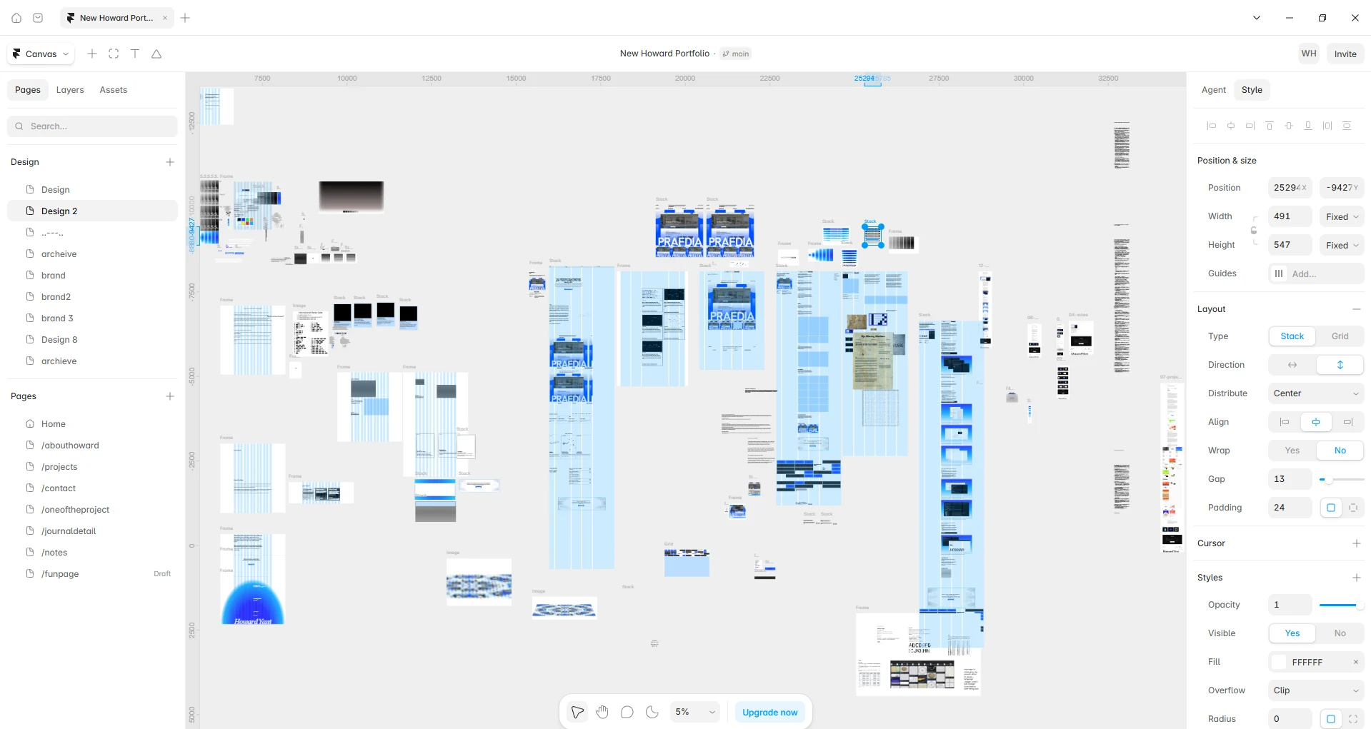
I began by experimenting with pixel drawing frames on the Framer canvas. While researching branding directions in tech circles, I noticed popular trends like dither and ASCII art everywhere. But copying what others did felt hollow. Most designers want to create work that stands out from the rest, and I felt that exact same drive.
As I dragged colors and geometric frames across the canvas, an idea suddenly clicked. Why not explore Morse code?
Morse code felt natural because of my background in Computer Science. Both Computer Science and Morse code share a technical foundation, but Morse code gave me a rhythmic visual language that genuinely represented who I am.
It started simply with traditional dots and long dashes. I love the open exploration phase because experimenting without rigid expectations uncovers ideas that you would never predict at the start.
Phase 2 - Branding (Morse Code and Babel)
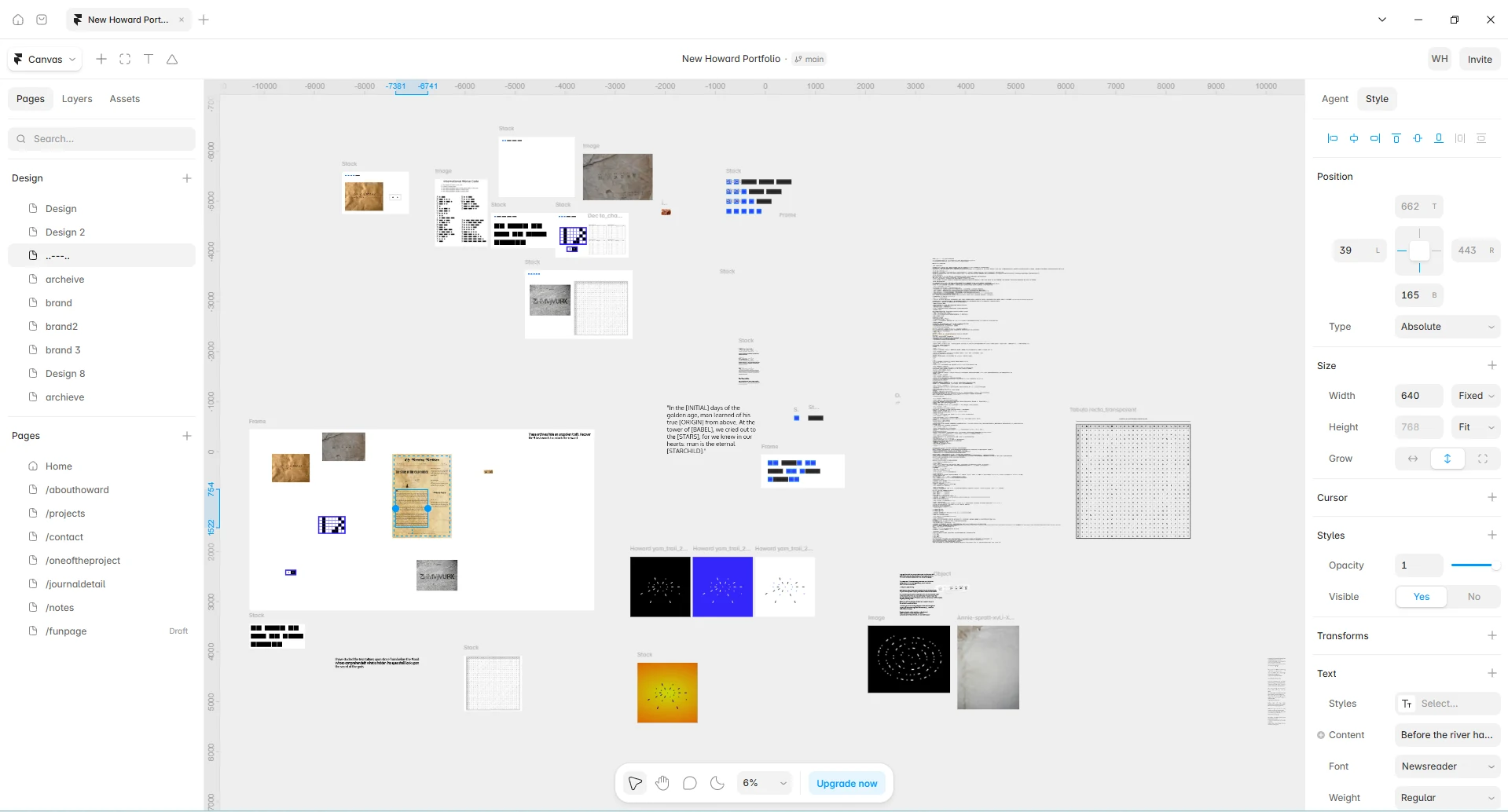
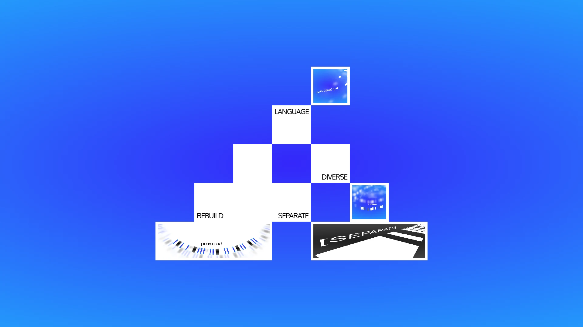
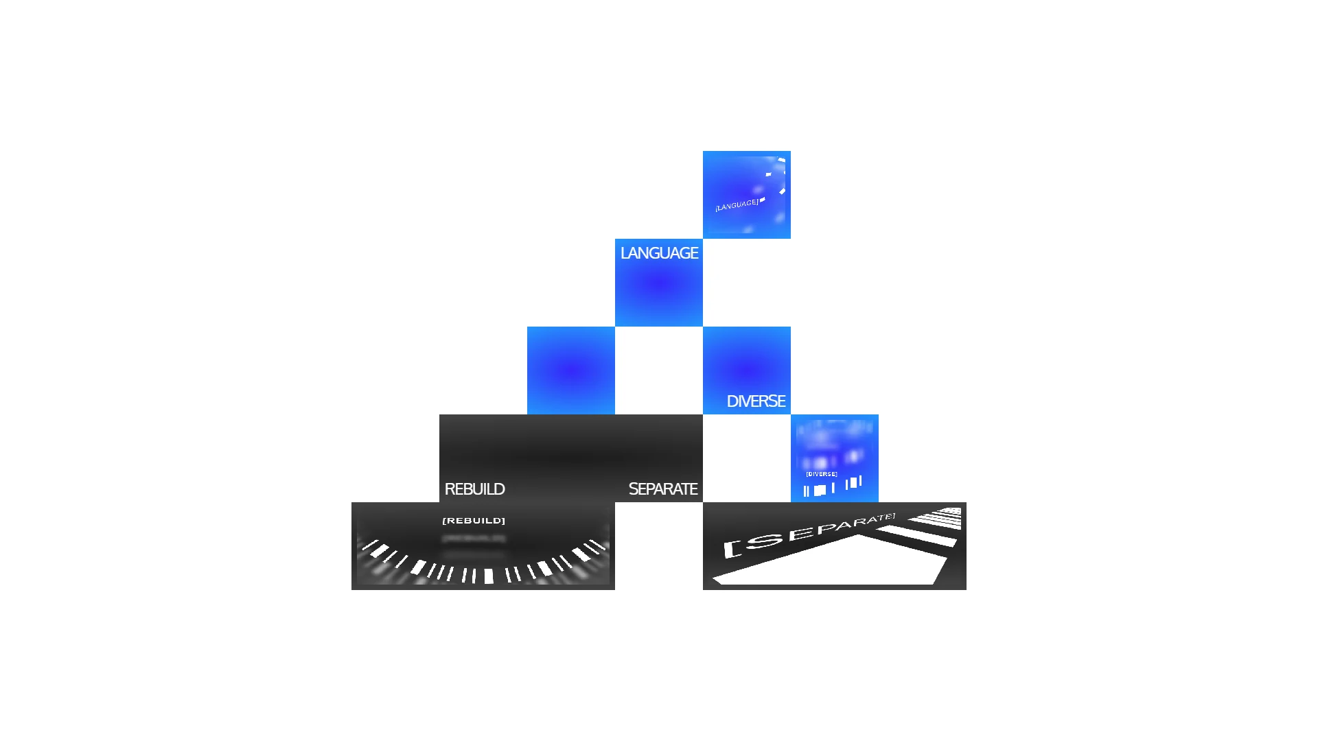
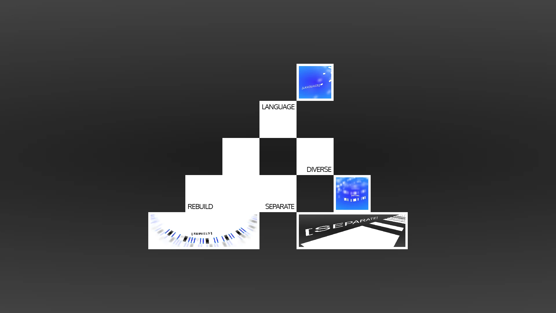
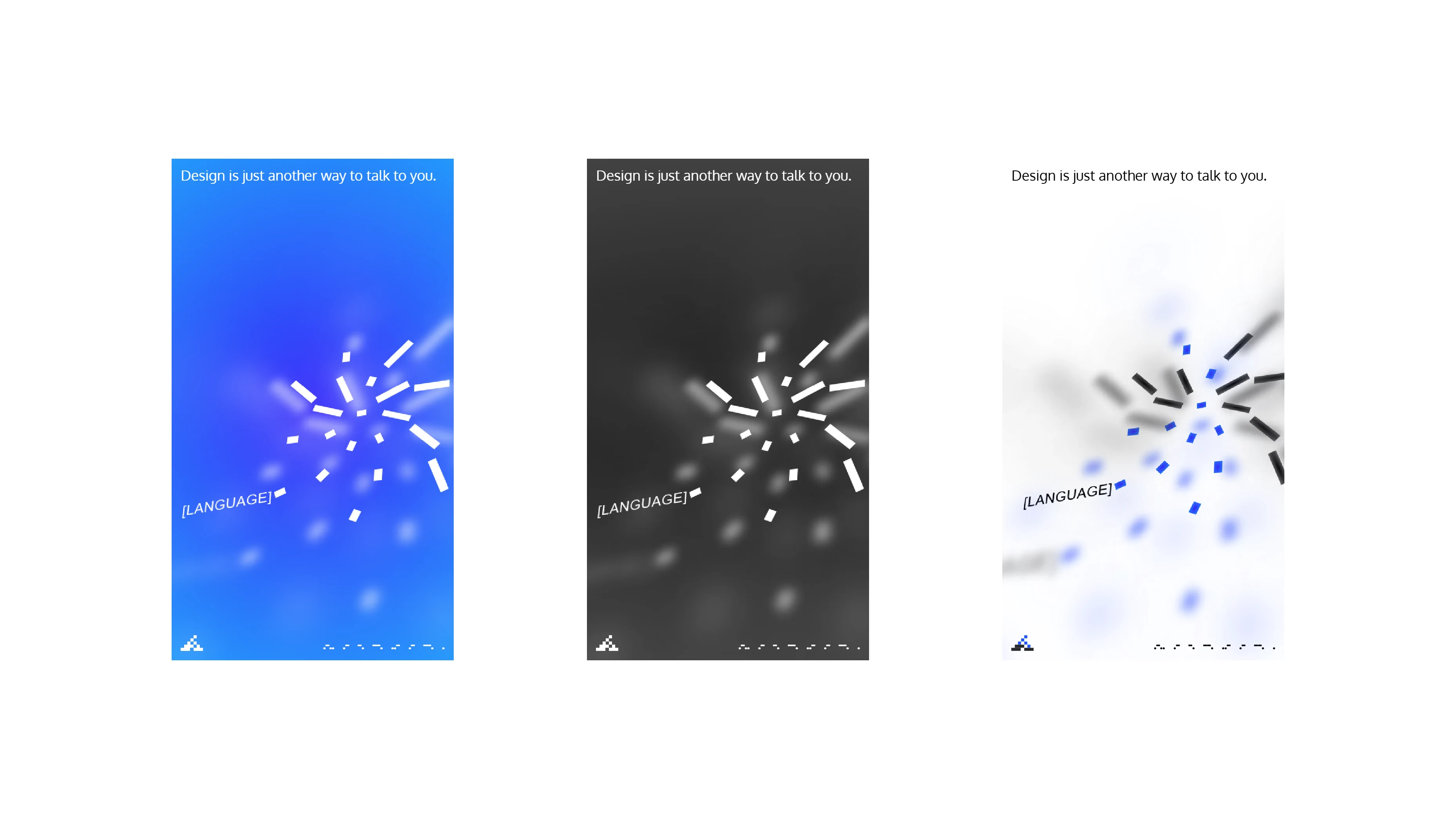
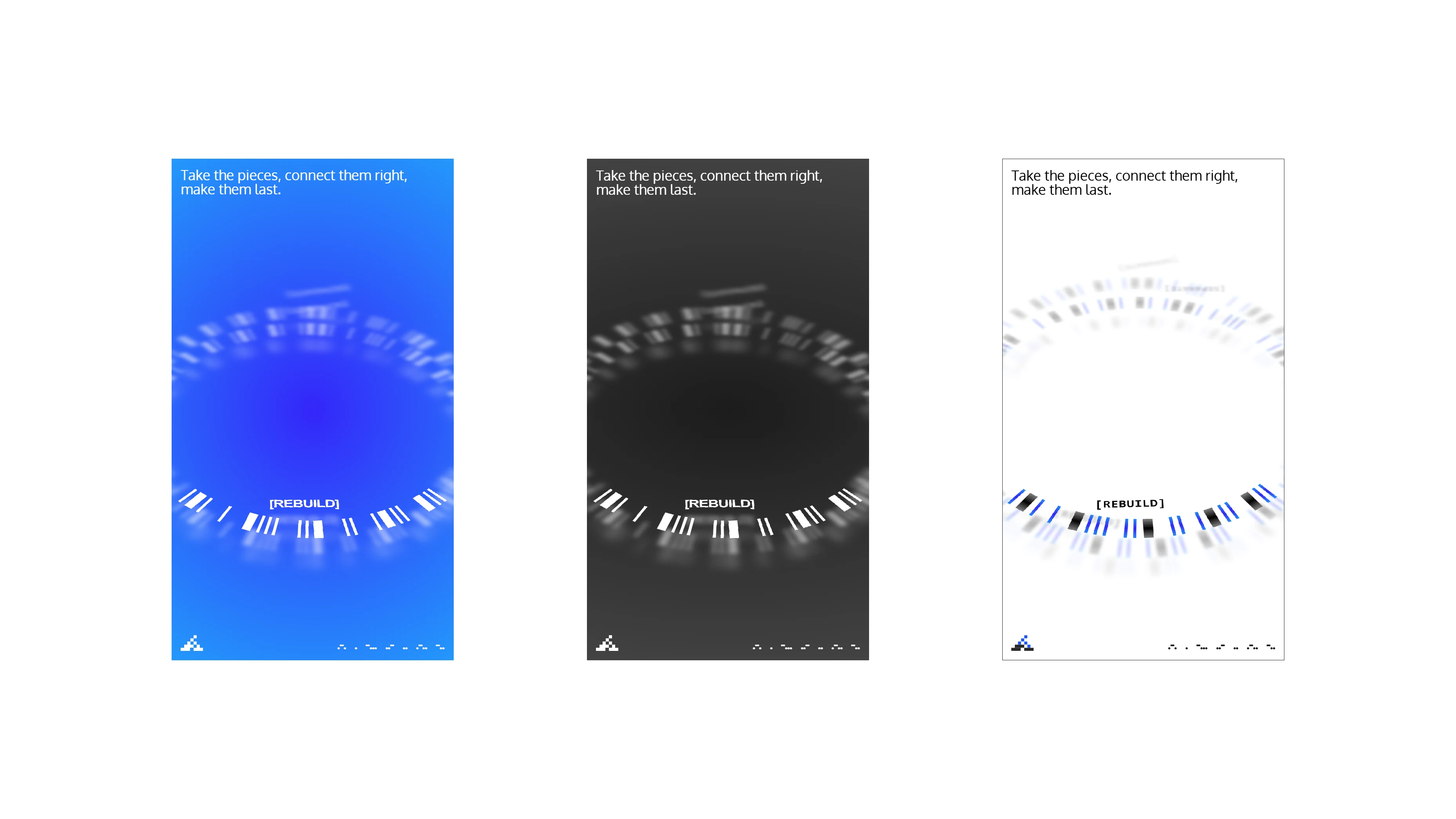
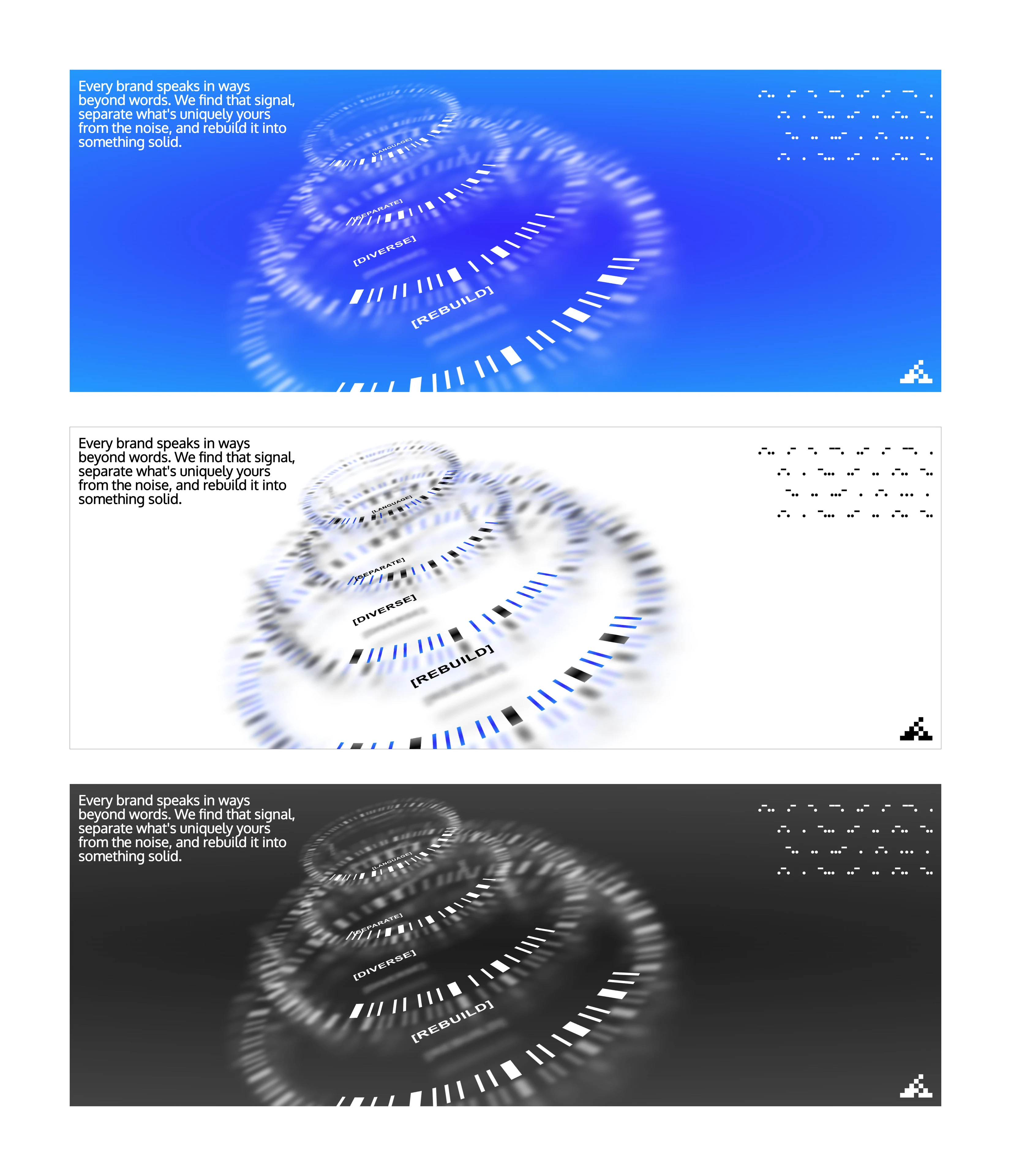
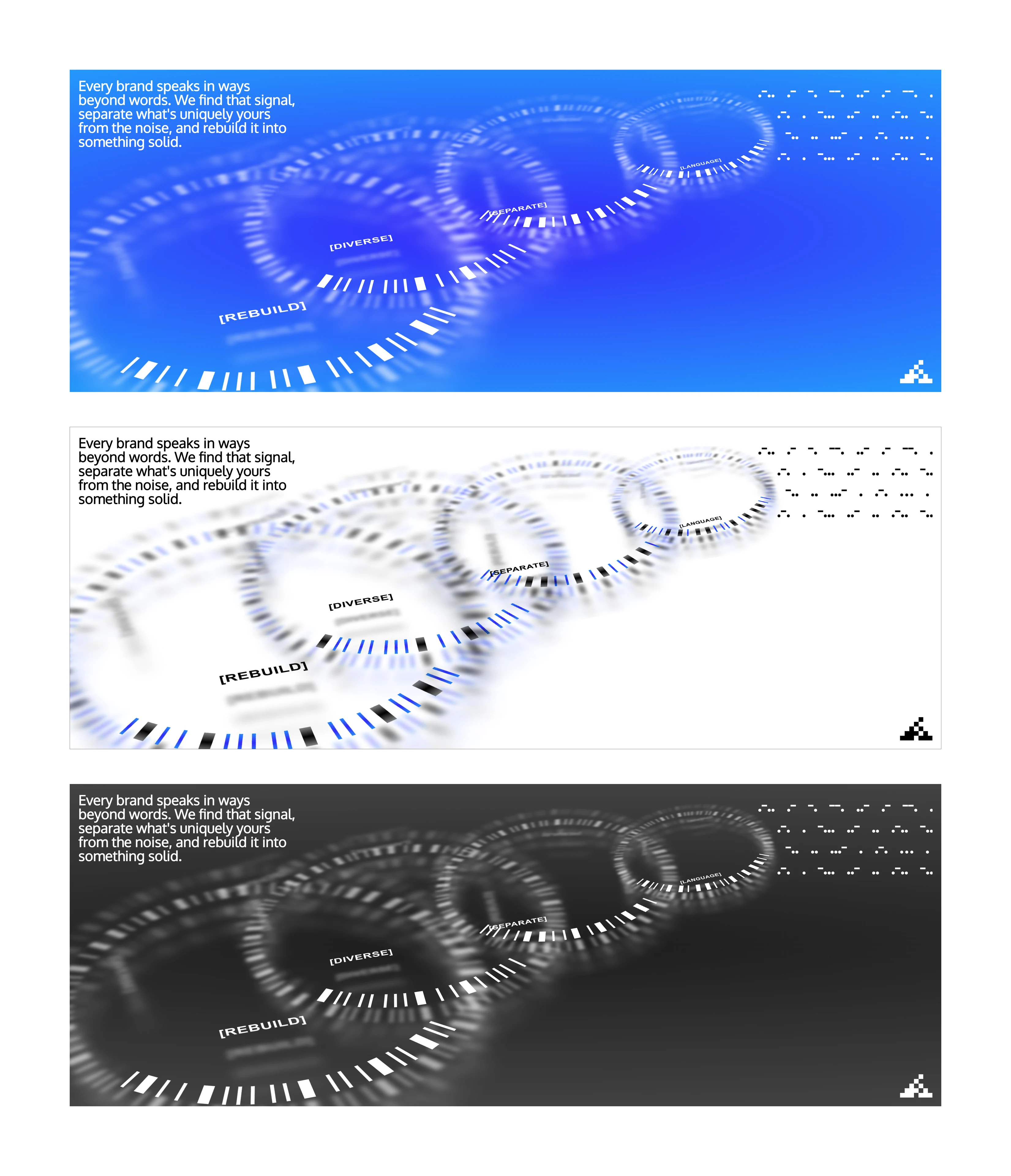
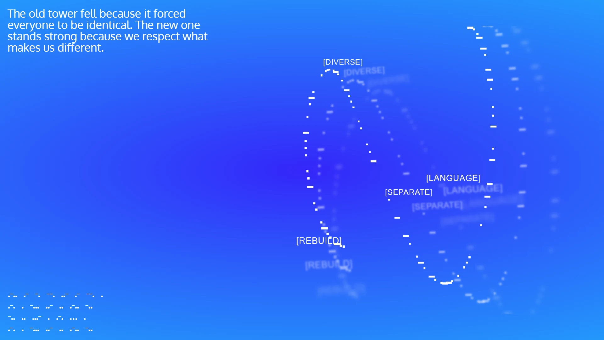
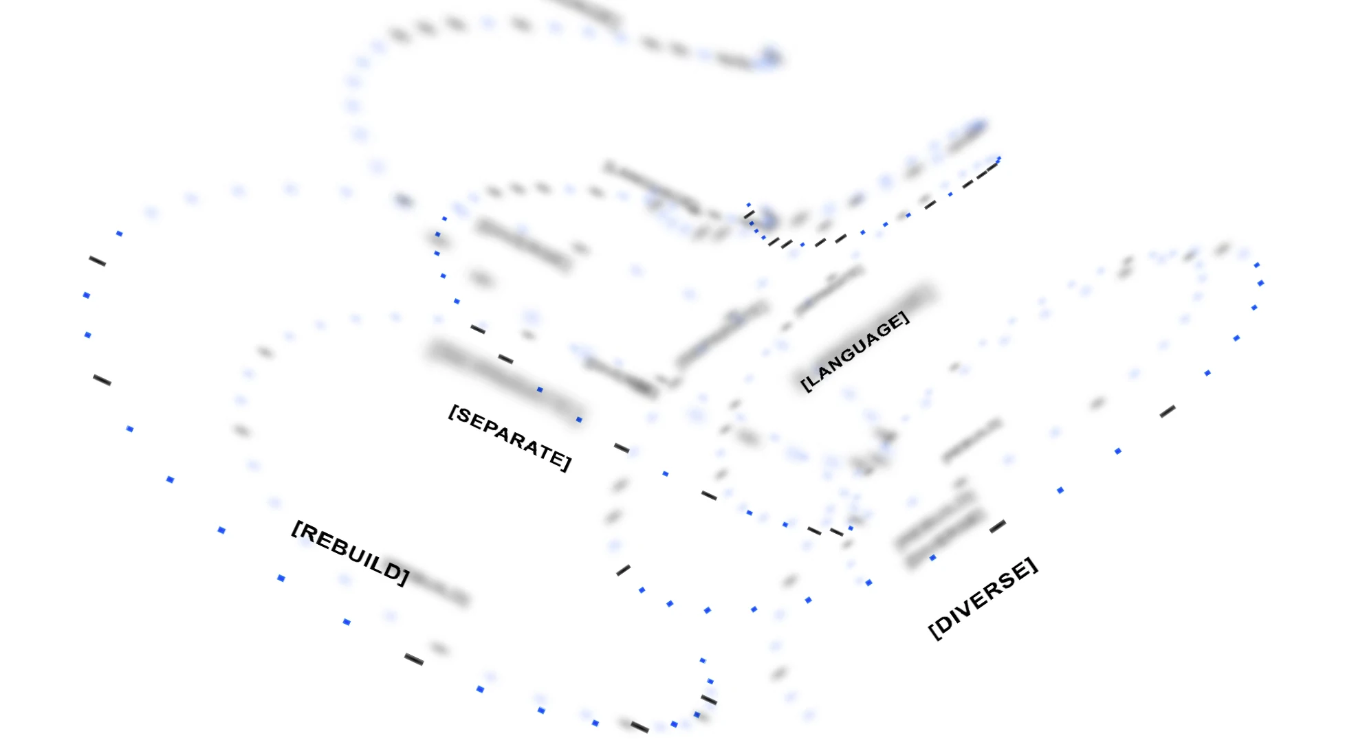
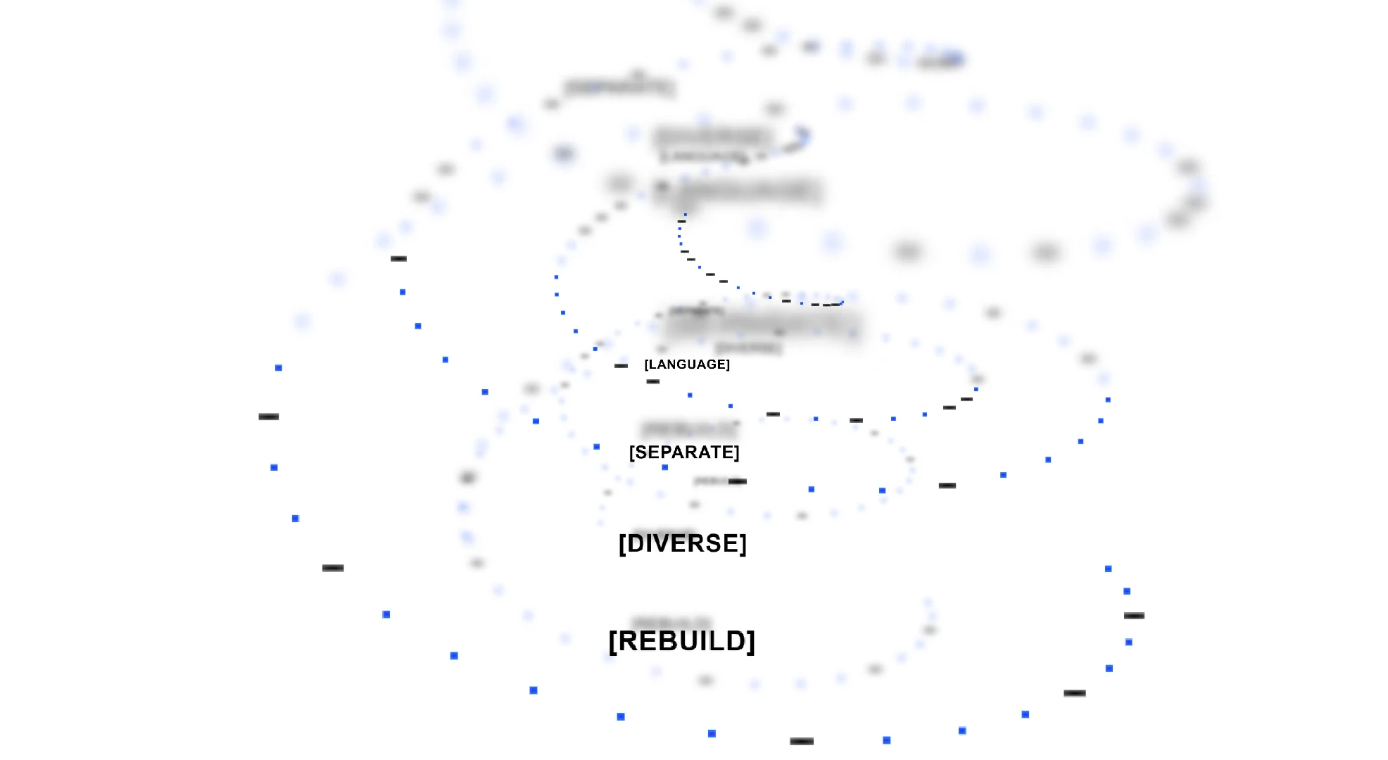
At first glance, Morse code and the Tower of Babel seem disconnected. But together, they form a cohesive brand philosophy anchored by four signature words, Language, Separate, Diverse, and Rebuild.
01. Language
The Cambridge dictionary defines language as a system of communication consisting of sounds, words, and grammar, as well as computer programming languages and technical vocabularies. Language can take many forms, including words, sounds, graphics, gestures, and UI interactions. But all of these mediums exist to convey one thing, a Message, along with the meaning, emotion, and underlying motive behind it.
This connects directly to the story of Babel. In the traditional narrative, God scattered humanity's language to punish man and halt the tower. But when I reflect on that story, a different truth emerges. If language alone was the real barrier, why do conflict, discrimination, and misunderstanding still happen every day within the same community, among people who speak the exact same language?
It happens because speaking the same words does not mean people attempt to understand the motive, heart, and emotion behind what is being communicated.
In design, Language means understanding the client's story and genuine motive before designing. What do they want to convey to their audience? What are they really selling? The same principle applies to Morse code on my site. What are these dots and dashes saying? Do they reveal my name and my story? Without understanding intent, there is no real connection.
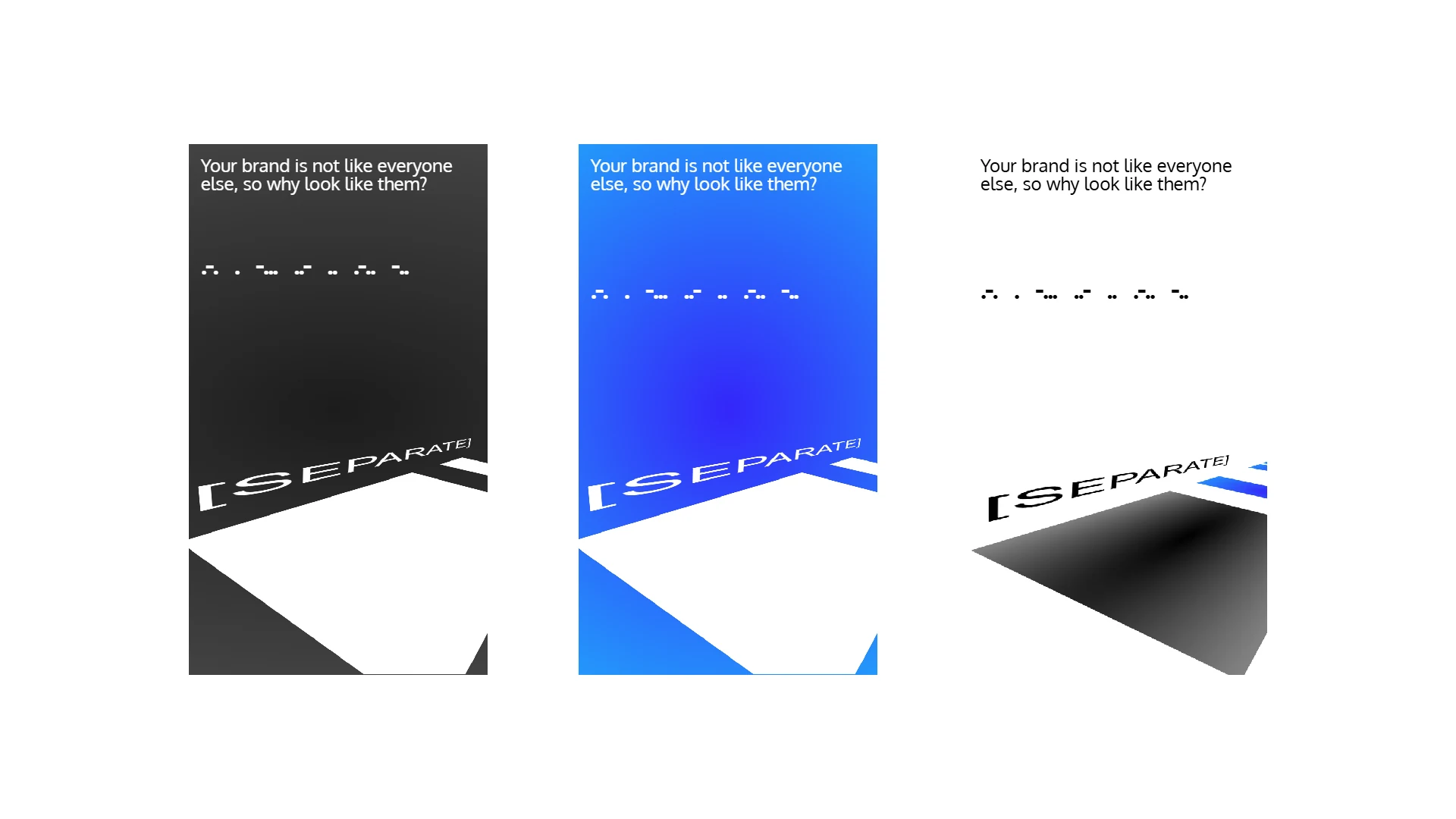
02. Separate
In the Babel story, humanity was scattered, causing languages and cultures to separate into distinct nations. In my design philosophy, Separate does not mean division or isolation. It represents the discipline of taxonomy and categorization.
Once the client's Language and motive are clear, I separate out the requirements, define the scope, and establish the distinct design directions needed.
For example, a concept like Apple in the Language stage can be separated into distinct expressions, a Morse code sequence of dots and rectangles, a written word, or a visual illustration. Separating these elements helps clarify the bigger picture.
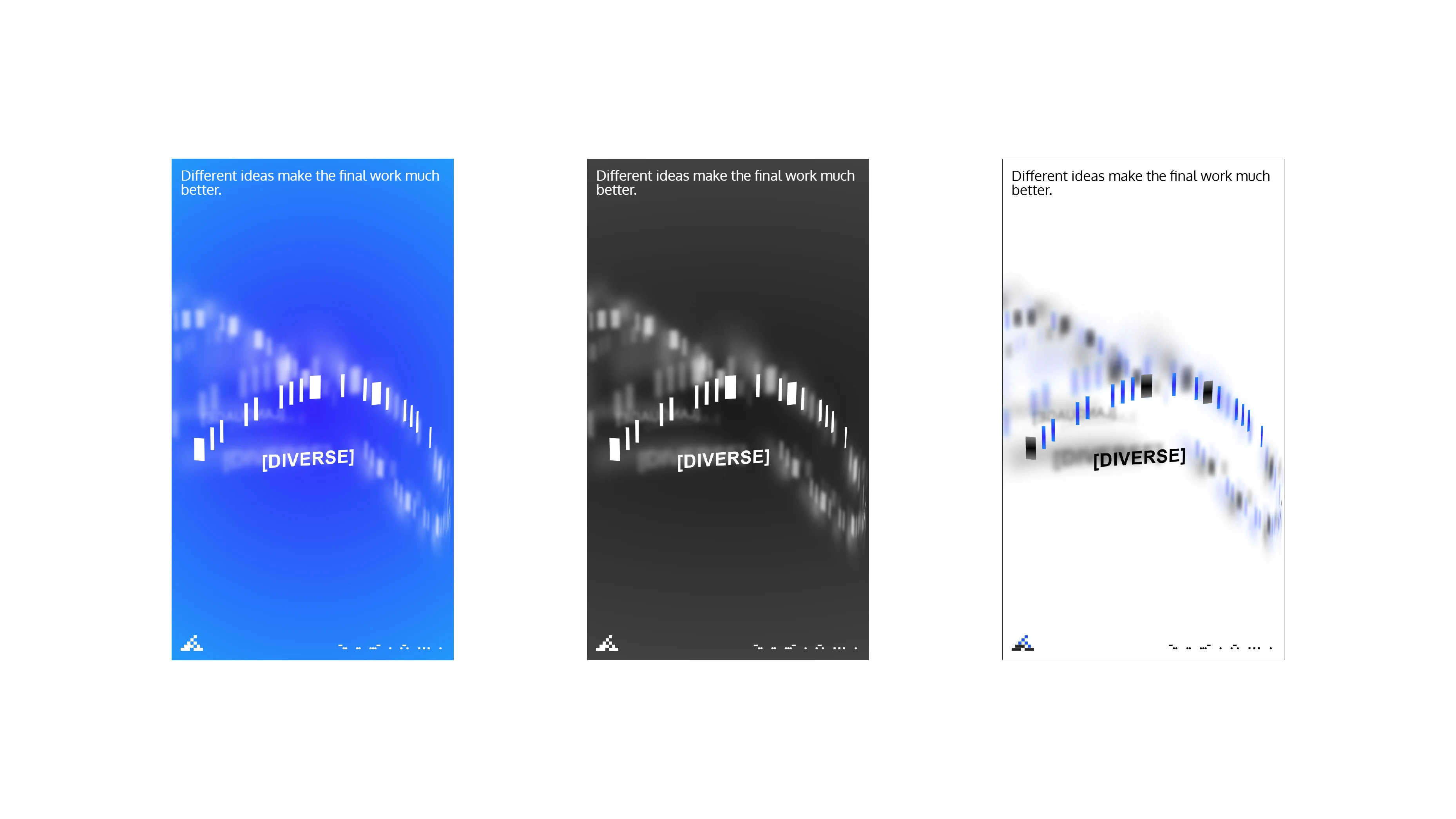
03. Diverse
Separation naturally produces diversity. When humanity was scattered, a rich tapestry of unique cultures, stories, and traditions was born. The same principle applies to design. Once elements are separated and clarified, they become diverse.
An apple is not just one thing. It can be a green apple, a red apple, or a yellow apple. The word itself can lead someone to think of Adam and Eve, while leading another to think of Isaac Newton and gravity.
Diversity is a strength. If the design world only embraced one trend, such as only Y2K styling, every website would look identical and boring. Because the world is diverse, we have infinite combinations to explore.
04. Rebuild
Even though humanity speaks different languages, remains separated, and is diverse, when we actively strive to understand each other's intention, we can rebuild a better world, a stronger Babel Tower that stands firm.
In design, after exploring diverse directions, I combine and rebuild those distinct elements into a cohesive new visual and digital system that communicates clearly and moves people.
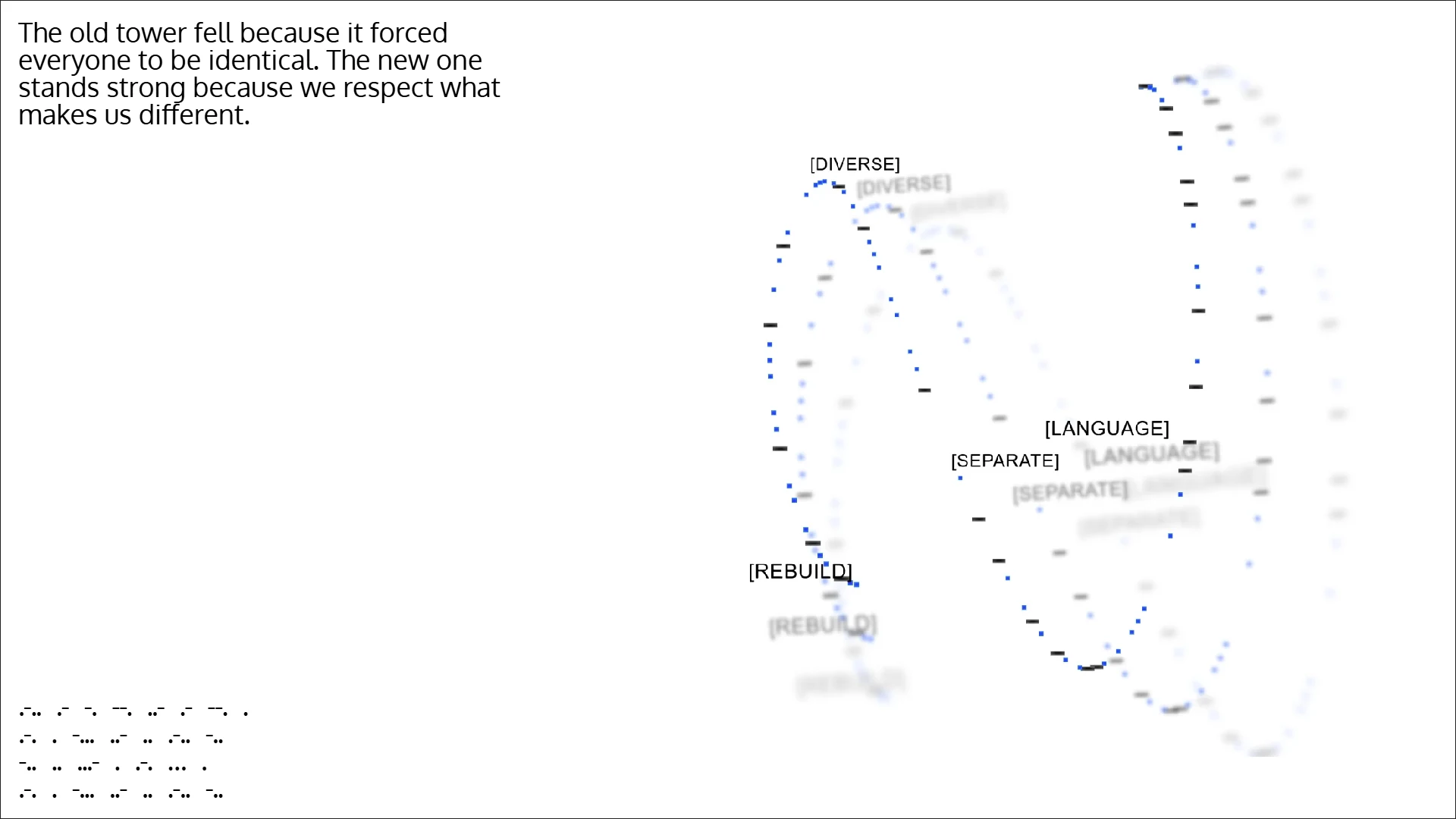
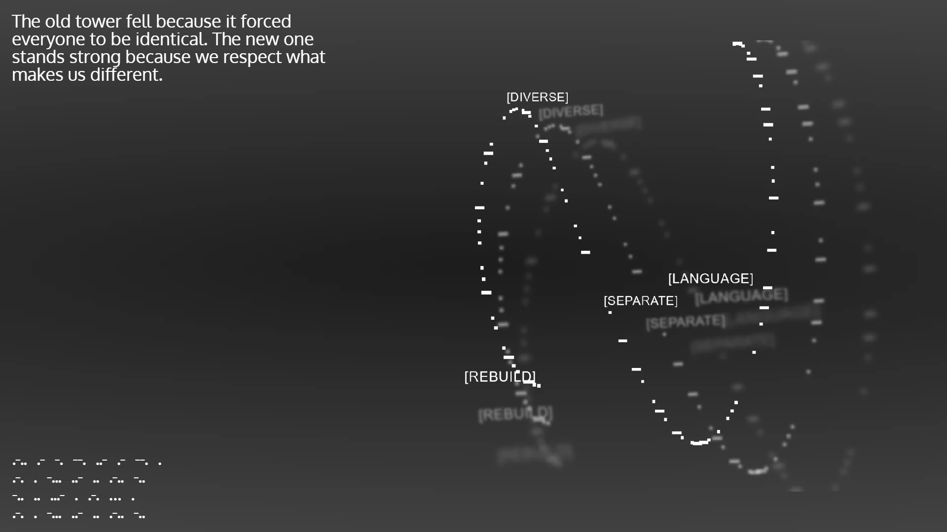
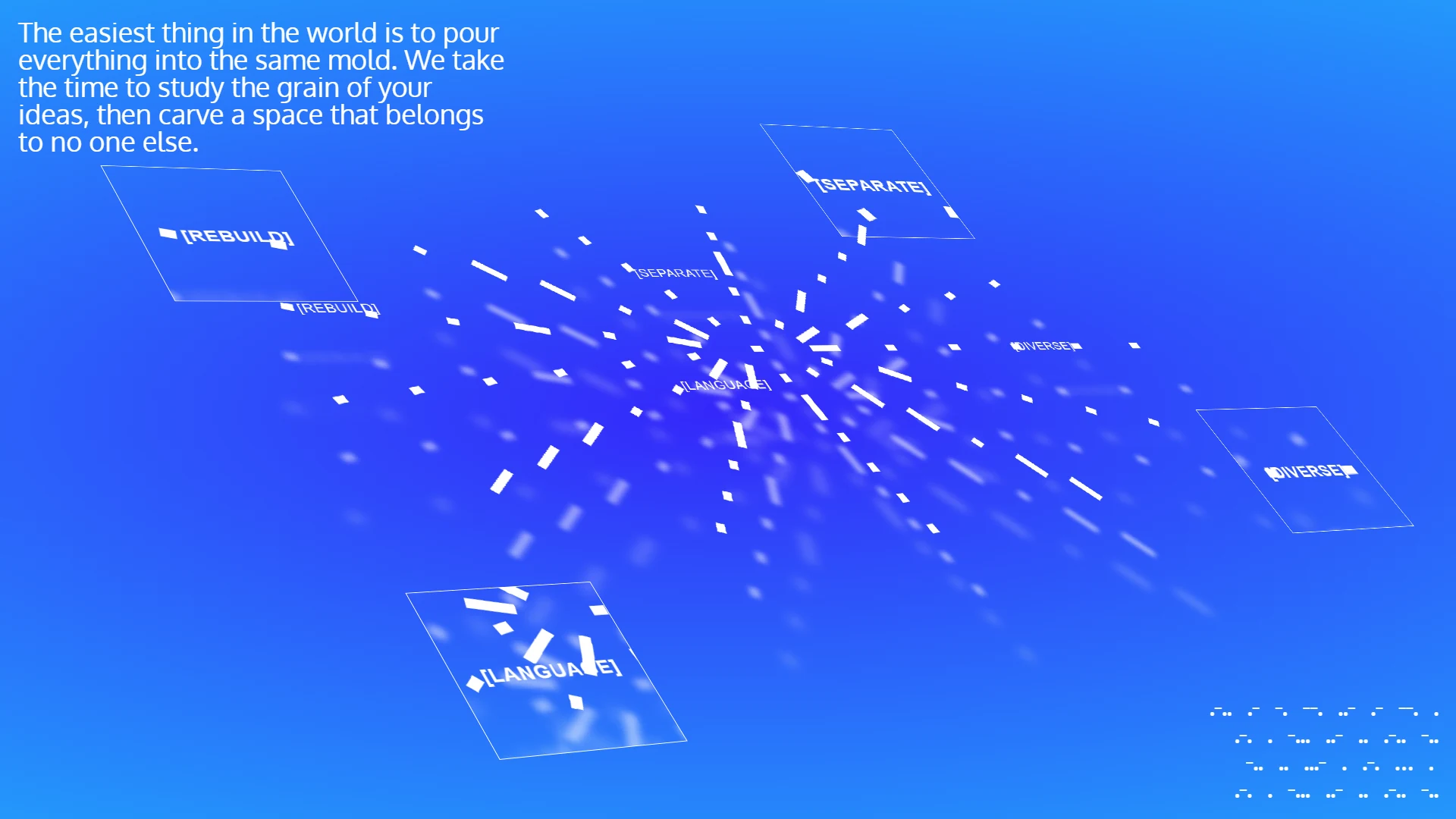
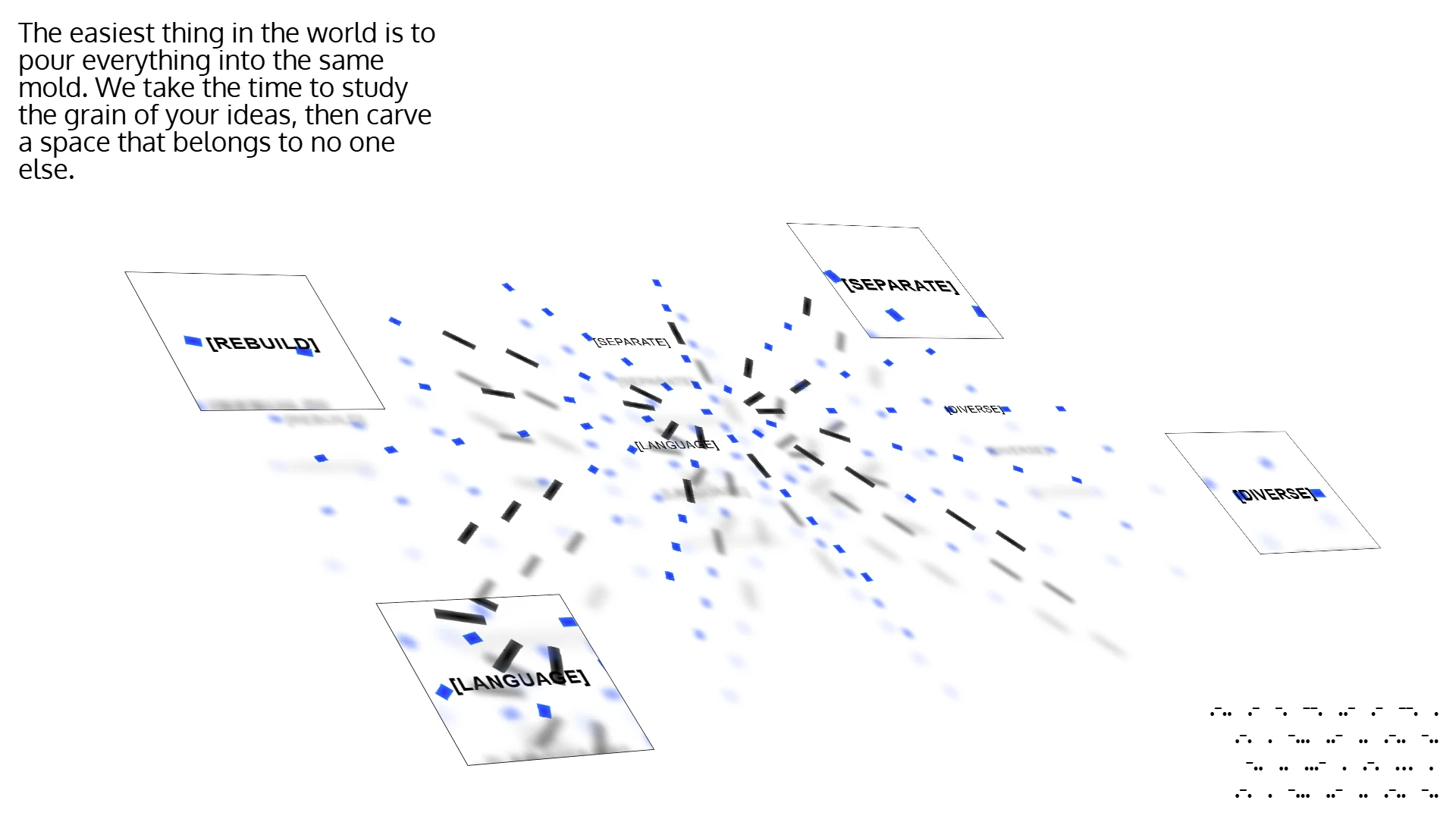
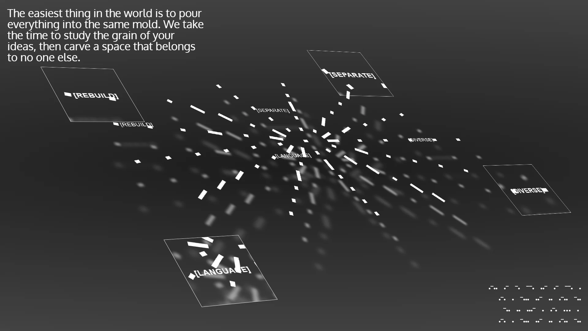
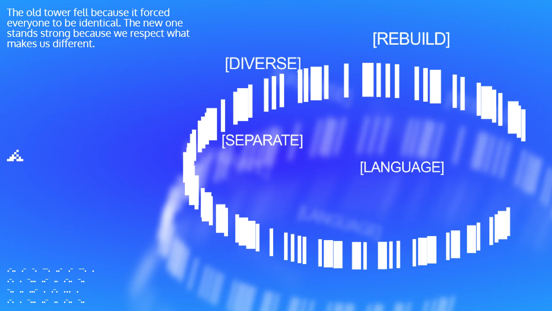
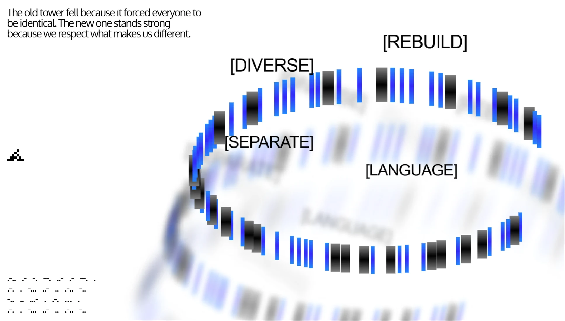
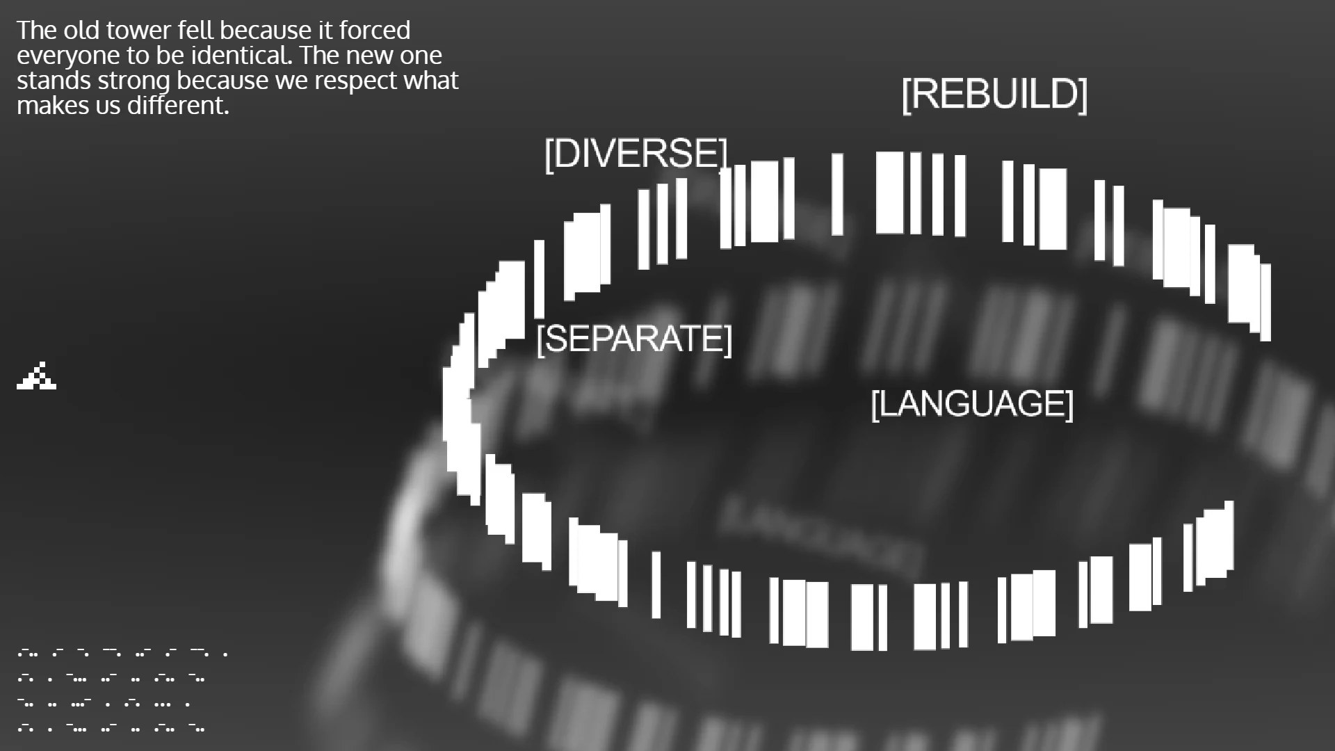
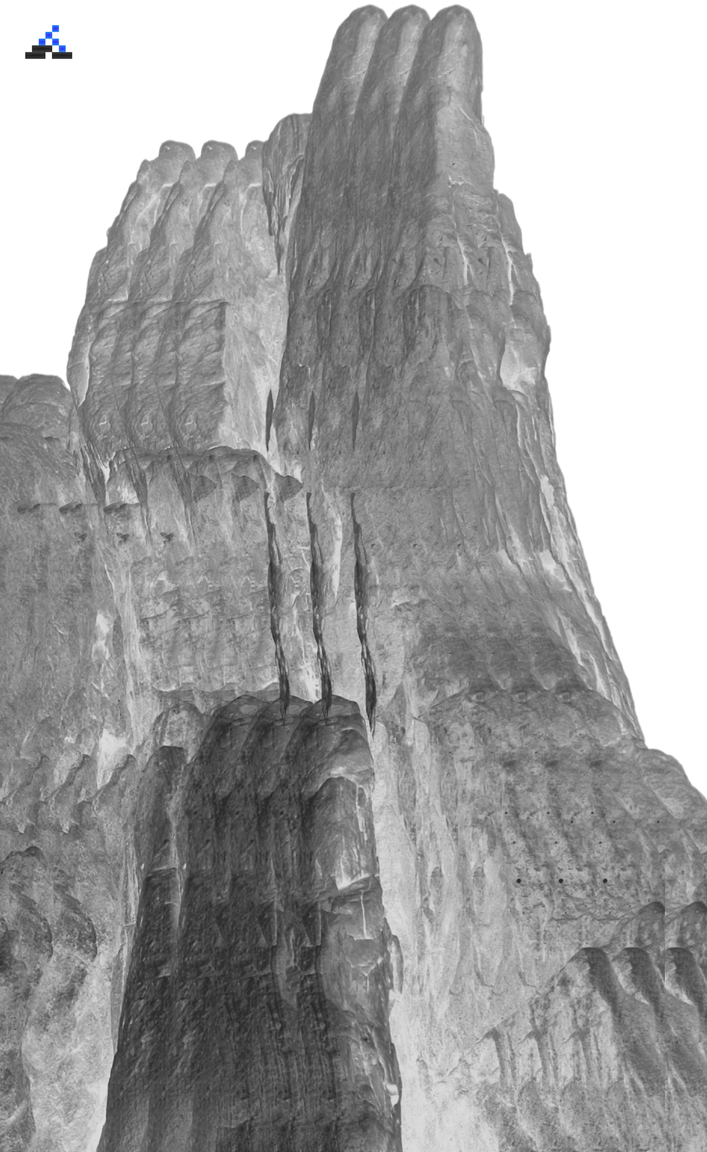
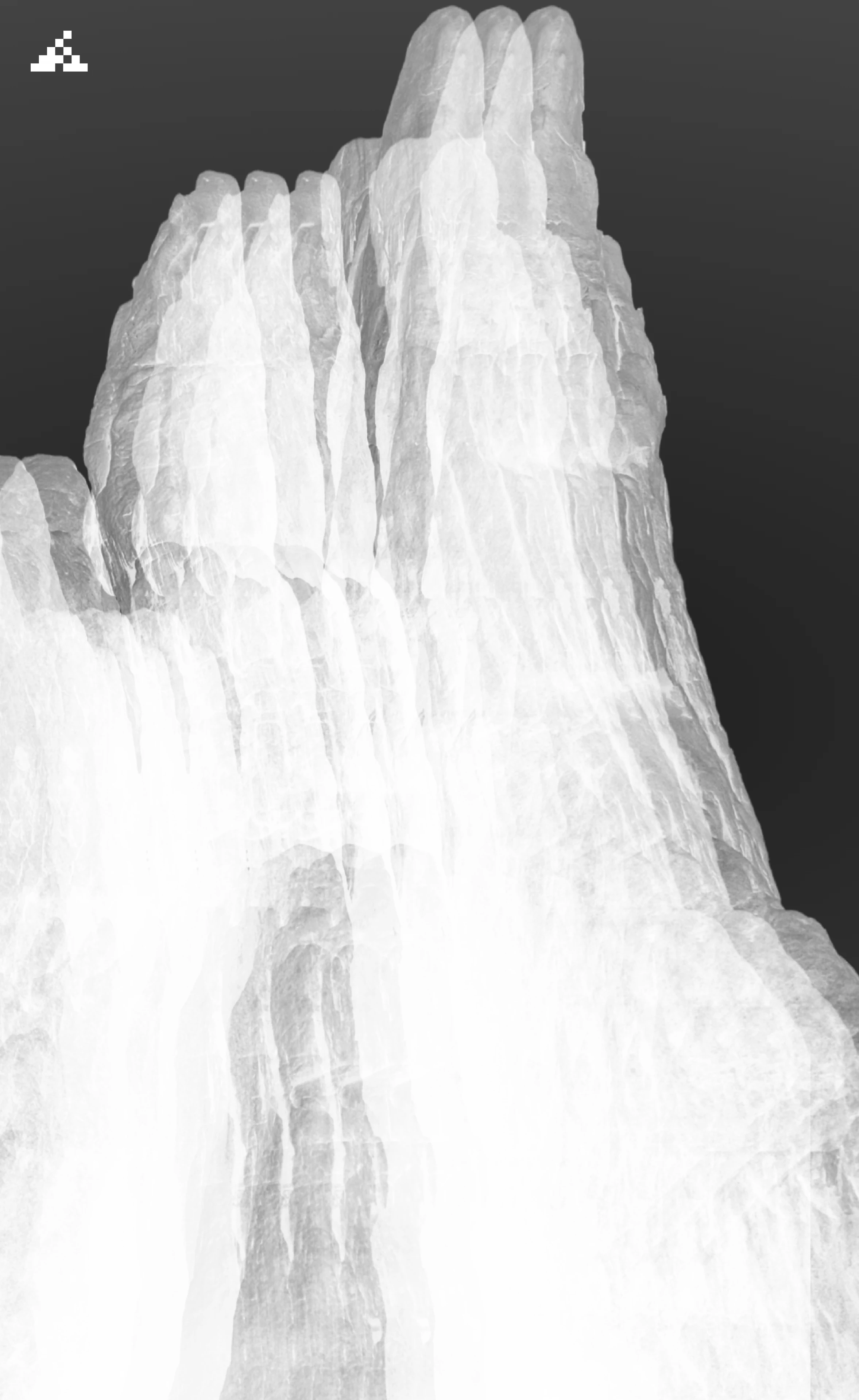
You can see this philosophy come to life across the website, from the Babel cylinder visual in the hero section to the rhythmic Morse code details.
Phase 3 - Tools and Motion Engineering
The design process did not stop with static graphics. I wanted to build interactive tools to test the limits of the Morse code visual system.
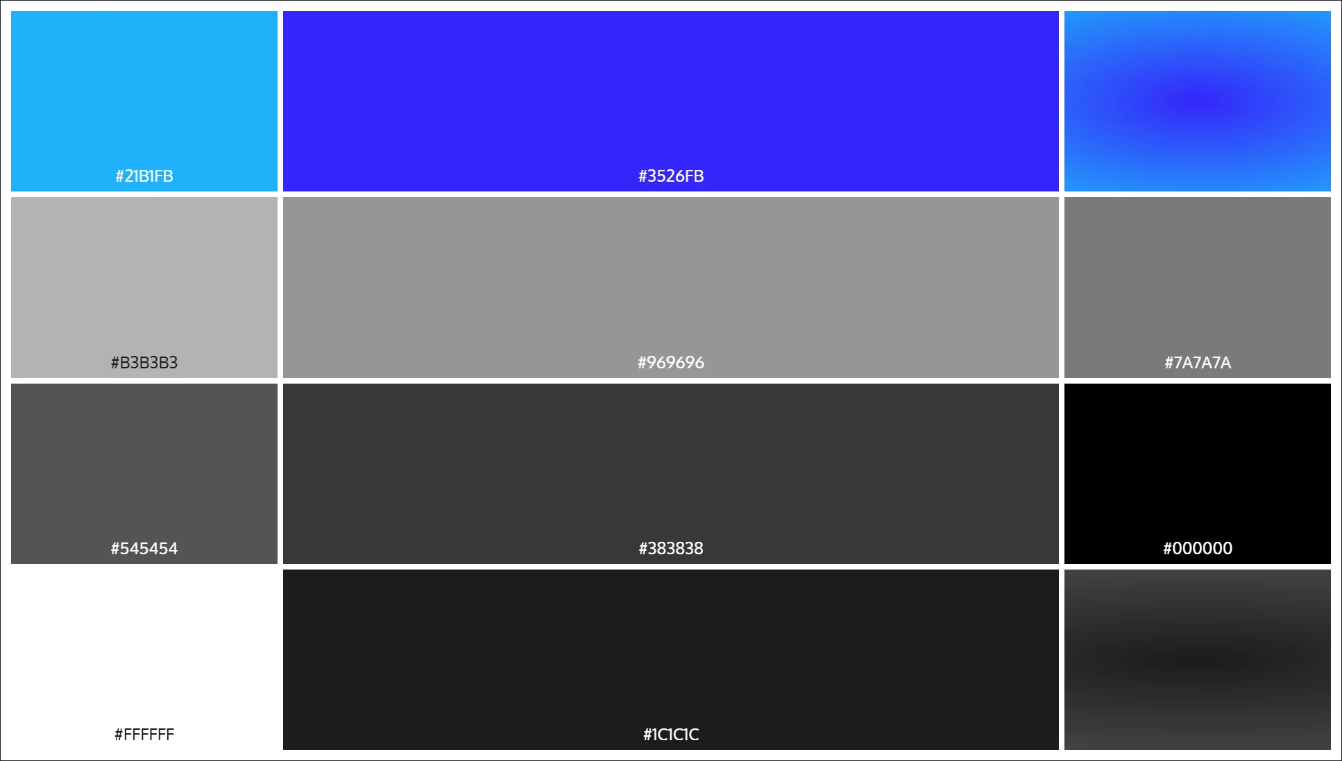
Most Morse code websites simply display generic text characters like dots and hyphens. Instead, I drew custom visual components in Framer, an electric blue dot and a solid black rectangle. I exported both assets as transparent PNGs and programmed a custom Morse code typing tool.
When typing any letter, such as A, the blue dots and black rectangles physically render on the canvas to form the Morse code structure of that letter.
As I experimented further, I added controllable variables and parameters to explore new visual possibilities. One tool led to another, building multiple generative utilities from the original concept. I fine-tuned the effects, exported transparent assets, and tested experimental layouts.
This generative workflow directly produced the fluid motion graphic seen inside the 3D cylinder on the homepage hero section.
Phase 4 - Easter Eggs and Discovery
To make the portfolio truly memorable, I wove hidden easter eggs throughout the entire experience. Clues, encrypted Morse rhythms, and historical inscriptions connect the hero section, the about archives, and the interactive footer.
Rather than revealing every secret upfront, the site invites visitors, design peers, and recruiters to explore, decode the interconnected clues, and uncover who Howard Yam really is.
Final Outputs
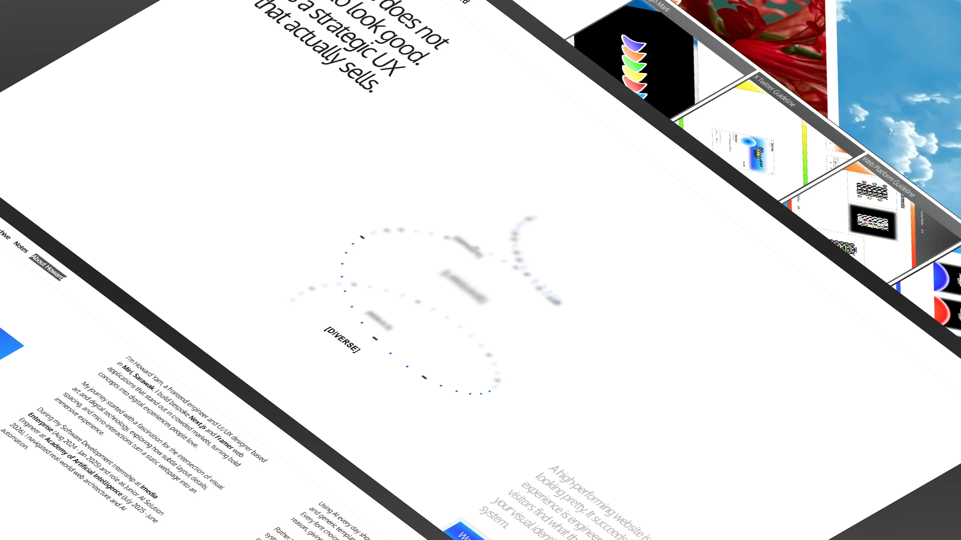
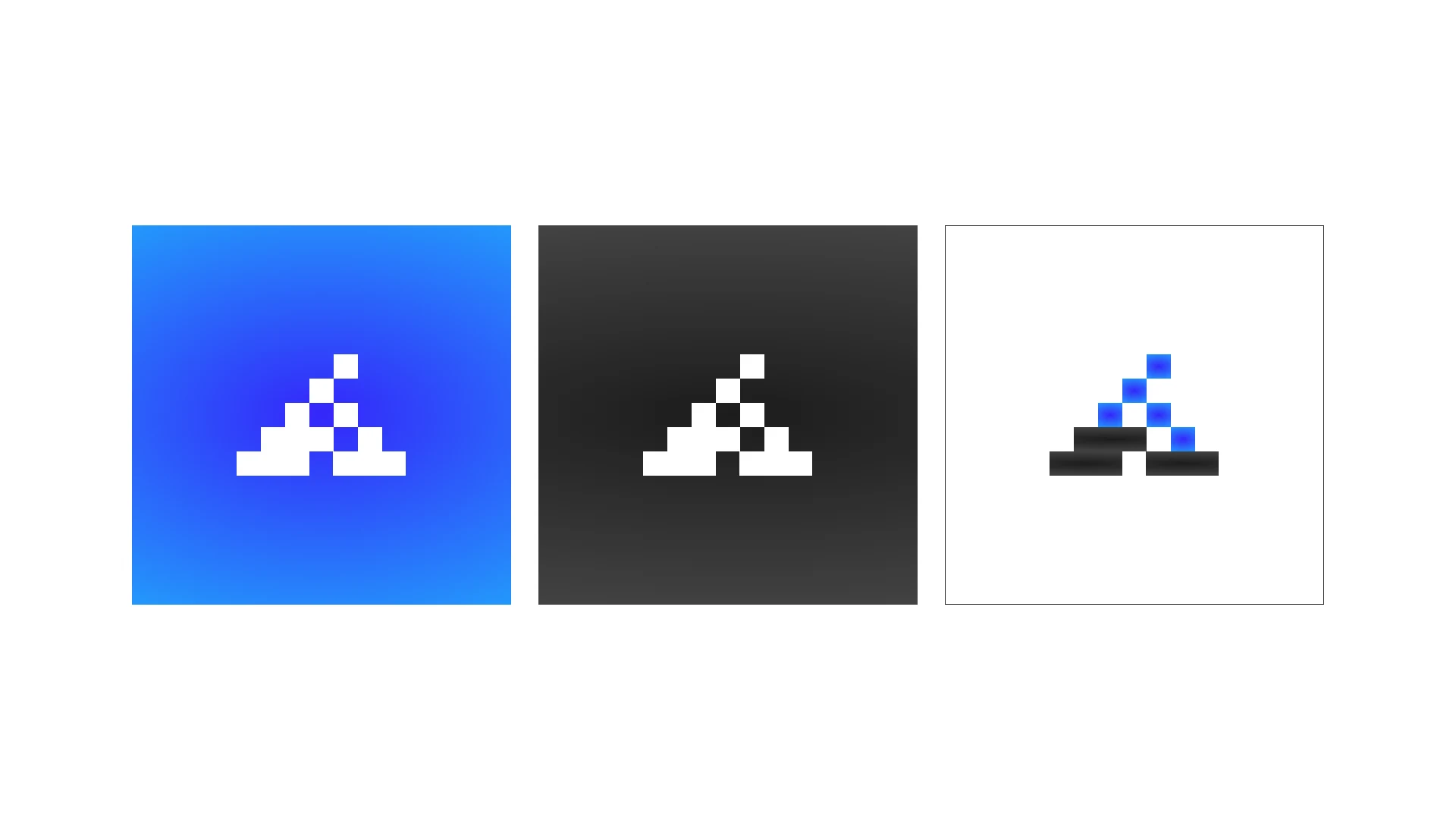
A live portfolio website with a brand identity that represents me, smooth motion on the homepage, interactive details, and a clean layout that loads fast on every screen.

What I Learned and What Comes Next
Building Version 2 proved that true creative distinction comes from open exploration and honoring personal roots, rather than chasing whatever visual trend is currently popular.
Whether creating a brand identity or engineering a web application, the most critical step is understanding the genuine motive behind the message. When you understand the intent, you can build digital experiences that truly connect with people.
Looking ahead, I will continue building custom generative tools, expanding the creative code archive, and pushing the boundaries of interactive web engineering.