Overview and The Motive
I have always wanted to start my own design studio, and OCEN is the concept brand I built to visualize what that company could look like. I also wanted to push myself and learn how to construct a comprehensive brand guideline completely from scratch.
Problem Statement
A lot of digital interfaces today rely on generic AI templates that feel repetitive. Because this was my own self-initiated project with no client brief, the hardest part was knowing where to begin. I did not have a clear picture on day one. Instead of waiting for inspiration, I started by experimenting directly on the canvas, sketching shapes, pulling vector points, and testing different ideas.
Goal
With OCEN, I wanted to create a brand that feels distinctly human, crafted for founders who want their SaaS landing pages and digital products to feel intentional and memorable. The goal was to establish a complete visual blueprint that balances creative warmth with disciplined brand rules across every digital touchpoint.
Role and Responsibilities
As the solo designer, I led the complete visual identity from initial concept to final brand guidelines. My responsibilities included brand core definition, logo rules and geometry construction, color systems, typography pairing, custom visual elements, and multi-platform digital asset frameworks.
Process
Exploration
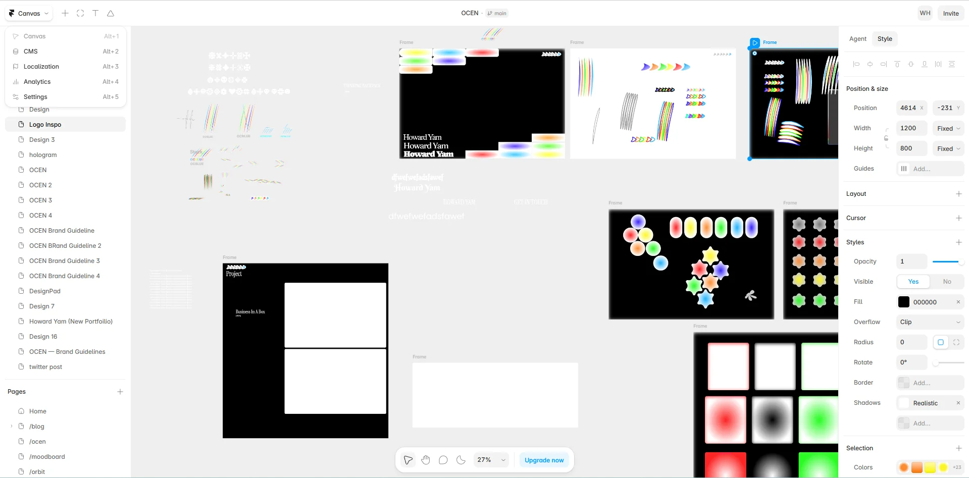
When I started OCEN, I did not begin with a rigid guideline or set of rules. I started directly with the logo on a blank canvas.
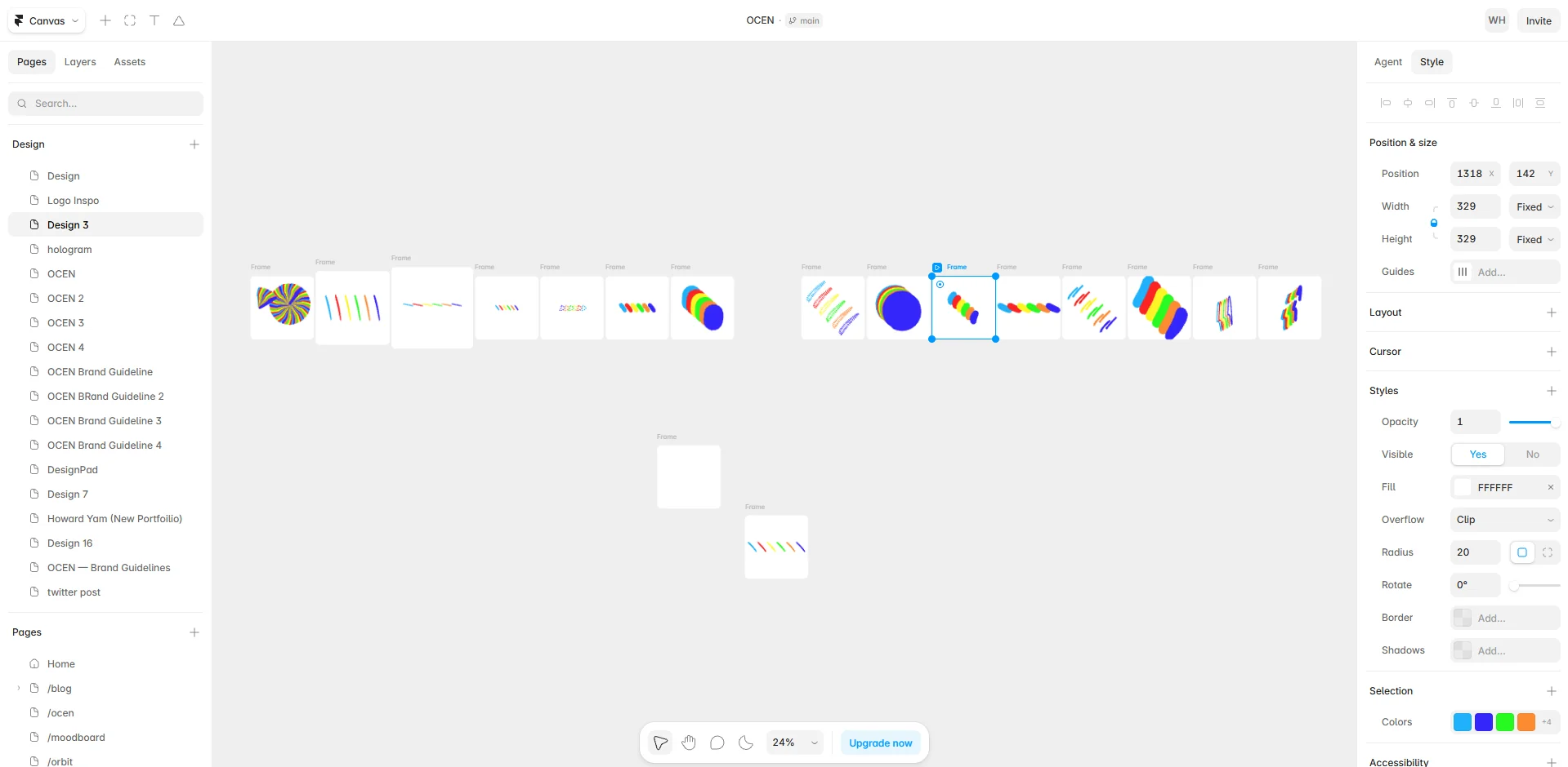
The logo initially looked nothing like what it is today. I spent hours stretching, squeezing, pulling vector anchor points, and playing with basic geometry to see what would happen. There is a special kind of fun in pushing shapes around without knowing the exact outcome beforehand. Through that constant experimentation, the smooth wave pictorial mark began to take form, eventually becoming the signature visual anchor for the entire brand.
Finding that mark gave me instant momentum and inspiration. It made me realize that brand identity does not have to be rigid or finalized overnight. The concept continues to evolve over time as I explore new visual ideas and digital touchpoints for the studio.
Final Outputs
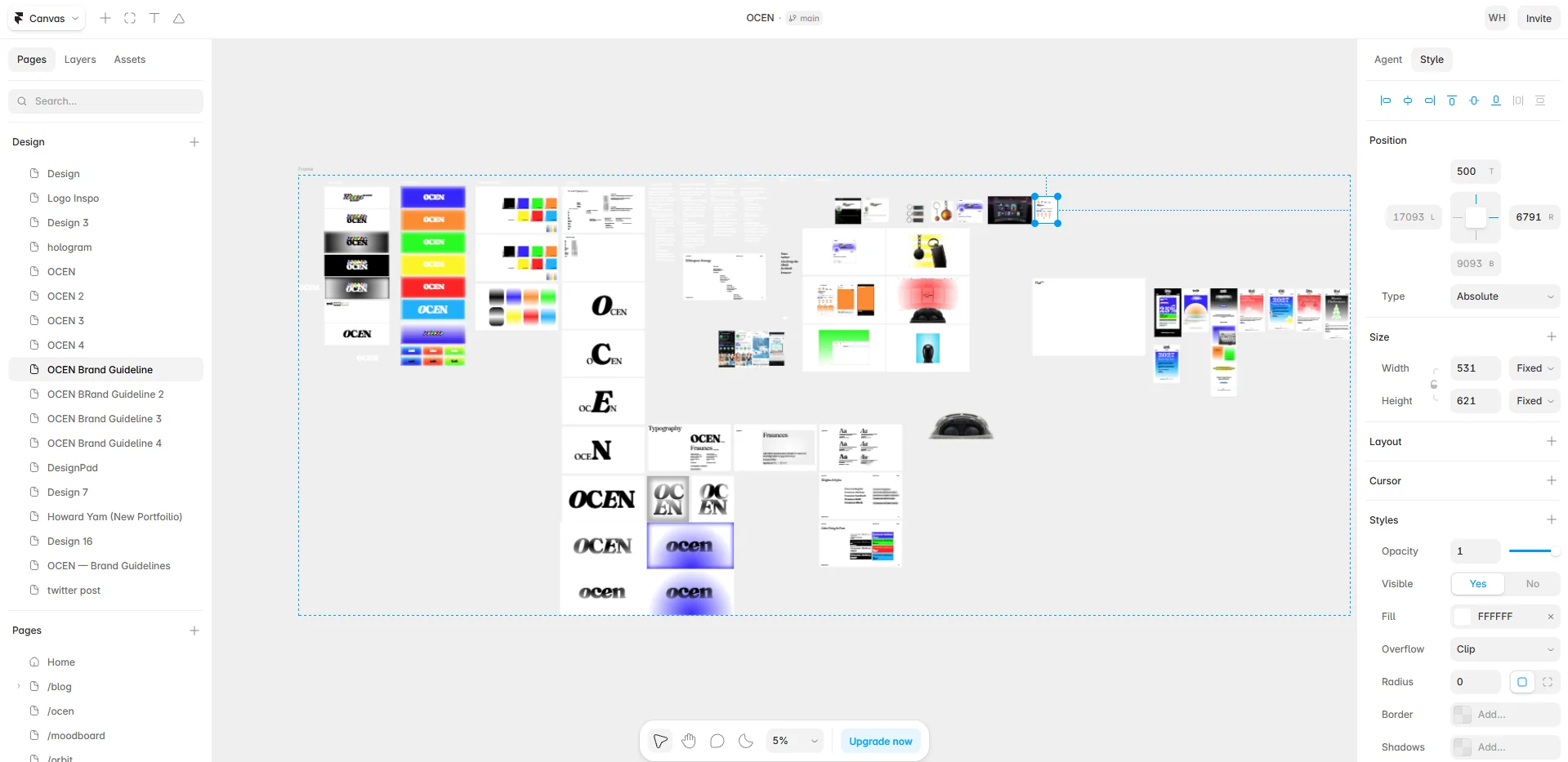
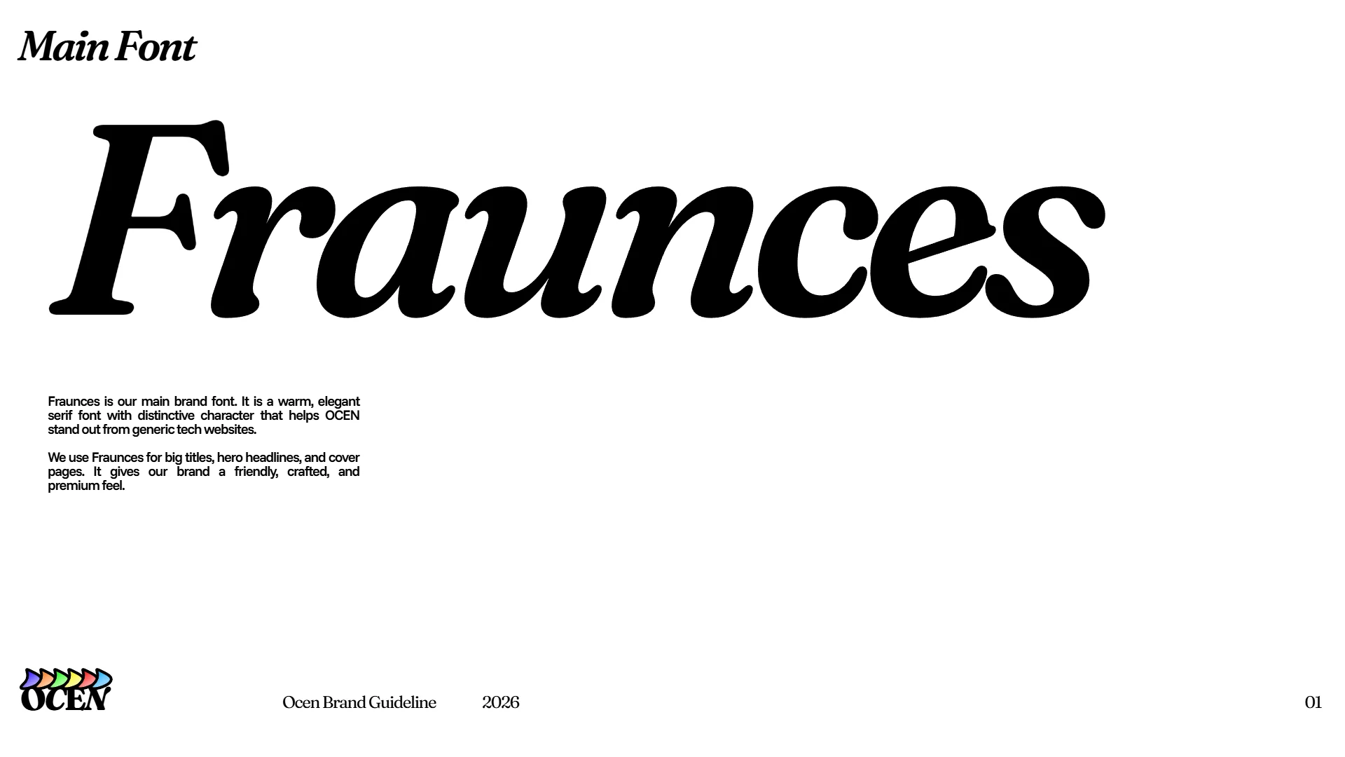
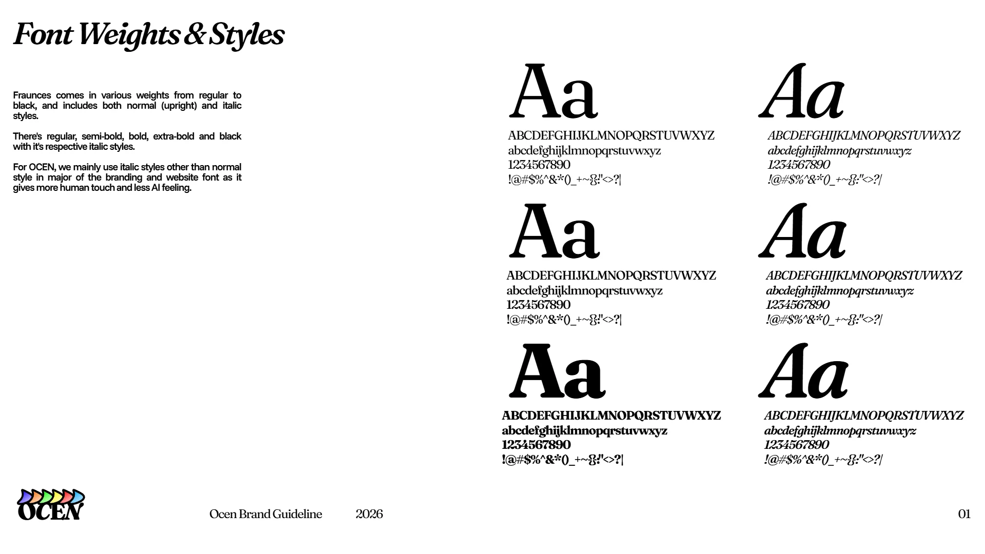
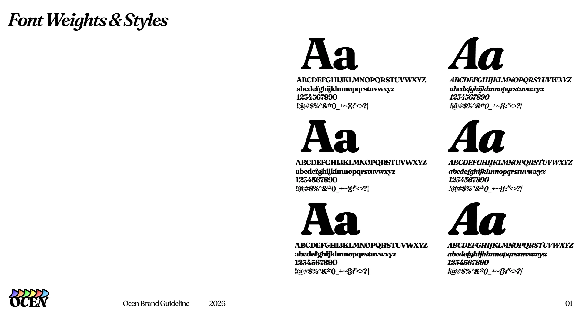
A complete multi-platform brand guideline system and touchpoint architecture, covering typography hierarchy, color codes, grid systems, logo construction, and digital asset templates across responsive channels.







What Comes Next
This project helped me turn an open idea into a fully documented brand guideline system. It gave me the blueprint for typography, color hierarchies, and social assets that I will use when I officially launch the studio. My next step will be taking these guidelines and designing the live, interactive OCEN website.